DEPTH AND SURFACE: Is painting, like art itself, a presentation of the “on top,” obvious, immediate?—and is it also a presentation of what is implied, deep, “below”?—and is art, consequently, an interplay of surface and sensation as “this” and depth and thought as “all that”? —Eli Siegel, from Is Beauty the Making One of Opposites?
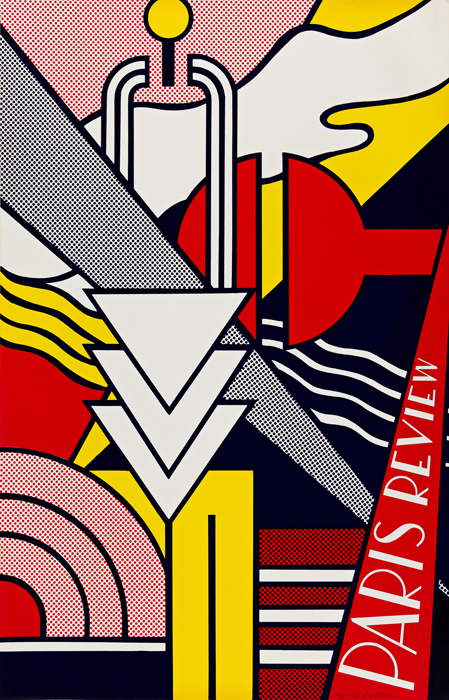
This silkscreen is wild—a composition of large, simple, abstract shapes in vivid colors: brilliant reds, deep blues, luminous yellows, vibrant blacks and bright whites that leap forth from the surface. And they also do something else: “Color,” Eli Siegel said in a class, “is the element that questions flatness. Color goes at you, and also recedes.” So color is against that flattening of reality that people can prefer.
I once thought the depths of people and things were uninviting. As Eli Siegel truly described to me, I “preferred the agreeable surface.” But that was a big reason I was so unsure of myself, and through my study of Aesthetic Realism I was able to change.
The way, in this print, those flat planes of color, outlined in black, overlap and intersect makes for a thrilling interplay of surface and depth. A slender yellow triangle darts down from the upper right to the lower left; as a deep blue triangle cuts diagonally upward, stabilizing the composition and giving it depth. Then shooting down from the upper left edge is the piercing, Ben-Day gray triangle. As it goes on top of and below the various forms, it leads to the rising red triangle inscribed Paris Review. These energetic, criss-crossing triangles lead in and out of space, like perspective lines taking us from surface to depth. Lichtenstein shows here, “the agreeable surface” leads us into the lively, friendly depths of things! —Marcia Rackow